Email is one of the most important channels for brands in many niches to communicate with their customers. Increasingly, users are checking their email on mobile devices rather than PCs and laptops. Therefore, when creating emails, marketers should pay special attention to the accuracy and responsiveness of the layout. In this article, I will discuss why you need email design, how to design an email newsletter, and what mistakes to avoid.
Why is email design so important?
A quality design will help you get the most out of your email newsletters: the appealing visual appearance will attract and retain the user’s attention, the adaptability to different devices will provide a positive user experience, and the correct placement of blocks and buttons will increase engagement and, therefore, revenue.
When used properly, email newsletters are a very effective tool. Let’s look at the statistics.
- In 2023, there were about 4.371 billion email users, a figure projected to grow to 4.594 billion users in 2027 (Statista).
- In 2023, email generated $10.6 billion in revenue globally, and this is projected to grow to $17.9 billion in 2027 (Statista).
- According to Litmus, email channels generate an ROI of $36 for every $1 spent.
- Mobile devices, excluding tablets, generate nearly 55% of global website traffic (Statista, 2022).
- Almost half (46%) of all smartphone users prefer to receive messages from businesses via email (Statista, 2021).
- A 2021 MailChimp study found that responsive design can increase unique click-through rates by 15%.
Types of email design
There are three main types of email design.
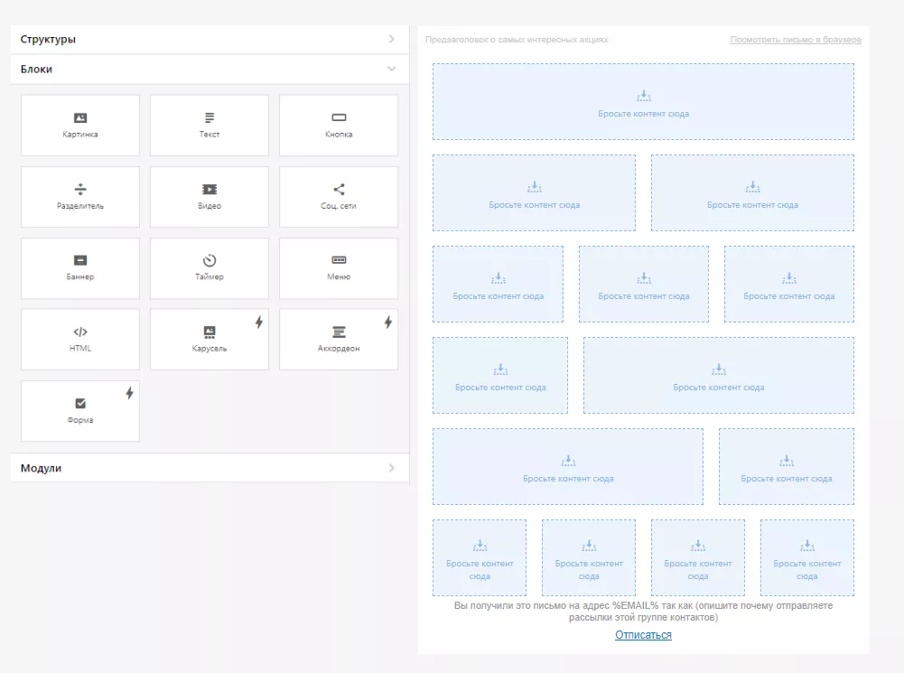
Design from scratch in the block editor
The drag-and-drop editor is an option for beginners and experts seeking high efficiency and minimum time spent on design. In this editor, you can add necessary elements, such as images, text, buttons, menus, and dividers. You can also experiment with the number of containers in the structure and manage their responsiveness.
Pros
- Low entry threshold: no high-level programming skills required.
- Prevents a large number of errors.
- Easy to view using standard email clients.
- Saves time.
- Possibility to customize one template for different email newsletters.
- Provides responsiveness in most cases.
- Often included in the client’s ESP or CRM, eliminating the need to install additional software.
Cons
- Features are limited by the functionality of a particular editor.
- Functionality may be limited in the free version. For more complex components, you need to pay extra or subscribe.
- The process of converting a design layout into a finished email becomes more complicated.
- Problems with mobile adaptation in cases where the design is different on desktop and/or more complex than the editor functionality allows.
- Display issues in light and dark themes.
- Similarity of designs due to the widespread use of drag-and-drop in the market.
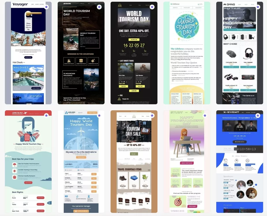
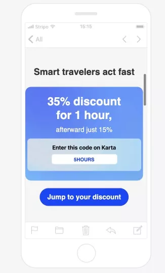
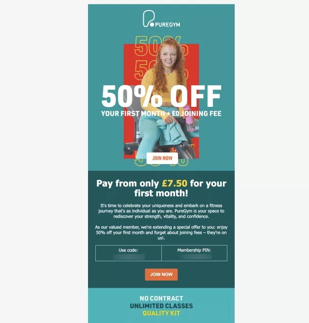
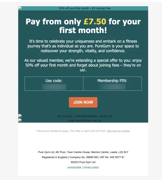
Design with ready-made templates
This option is very convenient for creating triggers and newsletters for specific informational occasions, creative designs, and finding inspiration/references. There are many such templates: festive (Birthday, New Year, Christmas, Black Friday), service (“Thank you for buying,” “Leave a review,” “Complete payment”), dynamic content (abandoned sessions, product recommendations), etc.
All you have to do is choose a suitable template and fill it with content.
Pros
- Low entry threshold: no coding knowledge required, even to create dynamic blocks in trigger emails.
- Minimizes errors.
- Reduces time even compared to block layout.
- No need to spend time on design development.
- Increases user engagement.
- Supports a variety of standard periodic email designs.
Cons
- The most creative and complex email templates require payment.
- The possibilities are limited by the functionality of a particular editor.
- The process of transferring the design layout to the finished letter is complicated.
- Problems with mobile adaptation when custom edits are made to the template.
- Problems with displaying light and dark themes.
- Similarity of designs due to the prevalence of drag-and-drop in the market.
HTML layout for the experienced and fearless
Creating a newsletter with HTML/CSS is an option that is almost unlimited in terms of implementing creatives. It is possible to:
- create non-standard looking default blocks (buttons, product cards);
- add a variety of email backgrounds;
- hide specific blocks/backgrounds/images on desktop and enable them only on mobile devices and vice versa;
- customize responsiveness for mobile devices.
For HTML/CSS layout, you can use online editors that display the result of writing code in real-time. For example, W3Schools, JSFiddle, or OneCompiler.
Pros
- Complete control over newsletter design.
- High flexibility and responsiveness.
- Accessibility: no subscription to the newsletter builder is required to create code.
- High uniqueness of designs.
- Effectiveness in visual information communication, as you can use creative calls to action.
- Compatibility with different email clients by using universal tags.
Cons
- Requires a high level of HTML/CSS knowledge.
- High likelihood of errors, especially if you are inexperienced, which can lead to display problems on mobile devices or in older versions of email services.
- Significant time is required to create each email.
- More validation steps to ensure proper display in email services.
- Incompatible with ad hoc communications, especially when you need to act quickly.
- Difficulty maintaining a consistent, recognizable brand template.
To save resources while still creating effective newsletters, the best option is to combine a drag-and-drop editor with HTML/CSS layout skills. This allows you to quickly create a high-quality email layout with the ability to customize and introduce non-standard elements using HTML/CSS.
Common email design errors
Let me tell you about the most common problems with displaying emails.
Neglecting responsive design
More than half of users check emails on mobile devices. Therefore, it is important to use a responsive design for email templates to ensure good display on mobile devices. If this is not the case, the user experience will deteriorate, the effectiveness of the emails will decrease, and the newsletters will gradually start to fall into the spam folder.
The solution. Test emails on mobile devices, tablets, laptops, and computers before sending. Test the actual view on your own device. If you need to test different screen sizes, email clients, or operating systems, use newsletter testing services like Email on Acid. They will help you minimize the number of email customization errors.
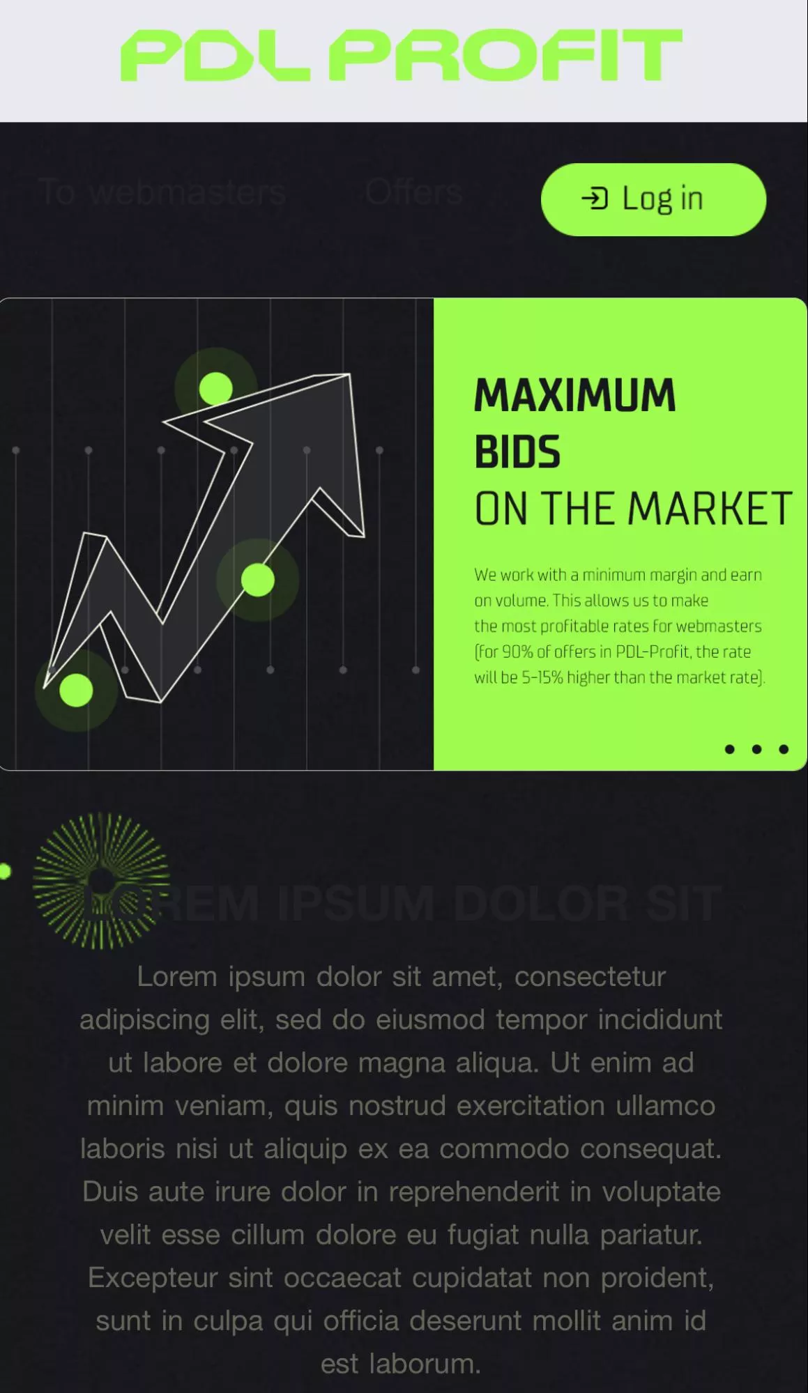
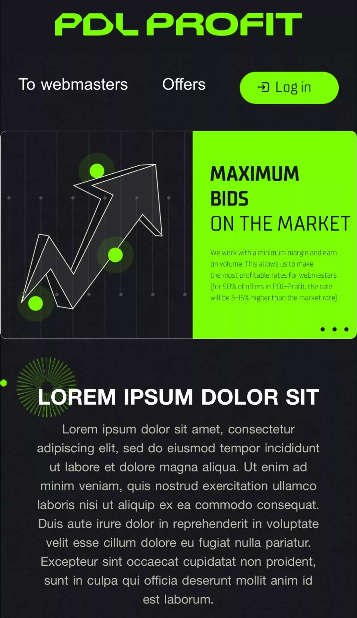
Desktop device
Dropped layout on a mobile device
Correct layout on a mobile device
Ignoring email client compatibility and overusing CSS and JavaScript
Different email clients (Gmail, Outlook, Apple Mail) display emails differently and often have limited support for CSS and JavaScript. Templates may look great in one client but not in another.
The solution: Test the email in different email clients to ensure compatibility. Use universal tags, readable font sizes and colors, and check to see if a particular email client supports your HTML code. The Can I email service can help.
Large files
Emails with large files take longer to download and get cut off or blocked by email clients.
The solution: Optimize images and minimize unnecessary code to reduce file size. The optimal email size for full display in Gmail should be no larger than 80-100 KB. Dynamic content weighs down the email, and a large number of blocks and images will slow down loading. The size of images can be minimized using photo editors and various software such as Tiny.png.
High dependency on images
Some email clients block images by default, resulting in blank or corrupted emails.
The solution: Always include alt text for images. The template should work without images, and the message should be clear without images.
Newsletter with image
Newsletter without image
Color inversion in dark mode
Many users default to dark mode to view content, which causes text and elements to blend into the background.
The solution: Set non-contrasting colors (not black and white) or replace the element with an image. In the first case, the text will be legible to the user even with inversion in dark mode, while in the second case, the image will help preserve the exact colors of the element since inversion will not work on it.
Light mode
A problematic dark mode
A well-designed dark mode
Inconsistent branding
This problem is caused by using a lot of different templates for different information occasions. Inconsistent branding tends to confuse email recipients.
The solution: Use one master template for all newsletters. The email template should reflect the brand’s personality (its color schemes, logos, and fonts) while still maintaining a clear association with the brand. To keep the template from becoming boring to the user, use a unique design and change it every 6-12 months.
Newsletter design best practices
Based on the most common mistakes, let’s discuss the most useful practices in newsletter design.
Image optimization
Large images can slow down the loading time of an email. Also, they may not display correctly on different devices.
- Use JPEG for photos and images with multiple colors.
- Choose PNG for images with transparency or simple graphics.
- Consider GIFs for simple animations and graphics.
- Use images that are about 600-800 pixels wide.
- Provide alternative text for images that don’t load due to accessibility issues or email client limitations.
Compliance with acceptable letter sizes
- The weight of the email should be within the limits of 80-100 KB.
- The font size of the body text should not exceed 14-16 pixels.
- The width of the email template should be approximately 600 pixels to fit within the viewing area of most devices and email clients.
Universal tags and inline CSS styles
Use universally supported HTML tags and attributes to ensure compatibility across email clients. Adhere to widely recognized HTML and CSS standards. Some email clients may not support external stylesheets, so use inline CSS styles to enhance the appearance of the newsletter.
For example:
<!DOCTYPE html>
<html>
<head>
    <meta charset="UTF-8">
    <title>Example of inline CSS</title>
</head>
<body>
    <h1 style="color: blue; font-size: 24px;">Title</h1>
    <p style="font-family: Arial, sans-serif; line-height: 1.5;">A paragraph of text with inline CSS</p>
    <div style="background-color: #f0f0f0; padding: 10px;">
        <p style="font-weight: bold;">A div container with an inline style</p>
    </div>
    <a href="https://www.example.com" style="color: green; text-decoration: none;">Your_website.com</a>
</body>
</html>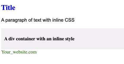
Here are some of the most commonly supported HTML tags for email templates:
Tag | Meaning |
<html> | Defines the root of an HTML document |
<head> | Contains metadata/information for the document |
<meta charset="UTF-8"> | Specifies the character encoding for the HTML document |
<title> | Defines a title for the document (not always visible to recipients) |
<style> | Defines style information for an email |
<body> | Defines the body of the email |
<table> | Often used for layout and content structuring |
<tr> | Defines a row in a table |
<td> | Defines a cell in a table |
<div> | Used to group various tags of HTML in a section so that styles can be applied to the section |
<p> | Defines a paragraph |
<h1>, <h2>, <h3>, <h4>, <h5>, <h6> | Defines HTML headings |
<a> | Defines a hyperlink |
<img> | Embeds an image in an email |
<ul> and <ol> | Defines an unordered or ordered list |
<li> | Defines a list item inside a <ul> or <ol> tag |
<br> | Defines a single-line break |
<hr> | Used to insert a horizontal rule or a thematic break |
<span> | Used to wrap sections of text for styling purposes |
<strong> and <em> | Used to represent text in bold or italicized style |
<font> | Defines font, color, and size for text (not supported in HTML5) |
<blockquote> | Defines a section that is quoted from another source |
Table layout
Although it may seem outdated, using HTML tables can help ensure a consistent display across email clients. Modern CSS layout techniques may not be fully supported.
Standard fonts
Use web-safe fonts such as Arial, Helvetica, Times New Roman, or Georgia to ensure that your email typography is consistent across email clients.
Hexadecimal color codes
Use hexadecimal (hex) color codes. These are widely supported by email clients and are a safe choice for defining colors.
<p style="color: #FF0000;">Red text</p>UTM parameters
Use UTM parameters to track campaign performance.
Add UTM tags to links in emails; this will allow you to track clicks and measure the effectiveness of email newsletters.
<a href="https://www.example.com/landing-page?utm_medium=email&utm_source=your_esp&utm_content=banner">
    Click here to visit our website
</a>
In this example:
- utm_medium=email indicates that the transmission medium is email – an email channel;
- utm_source=your_esp indicates that the source is “your_esp” – a mailing list service;
- utm_content=banner indicates that the content from which the link was clicked is “banner” – a banner.
When a recipient clicks on the link in the email and visits the website, the UTM parameters are passed to an analytics platform or tracking system. You can then track the effectiveness of the email campaign in terms of the medium, source, and content that drove visitors to the site.
Media queries
Media queries in CSS are used to apply different styles depending on the characteristics of the user’s device. They are most useful in adaptive web design to ensure that the layout and style of a website are suitable for different screen sizes, resolutions, and other device characteristics
However, not all email services support media queries, so testing is required before sending.
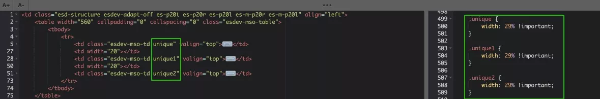
In this case, we set the three blocks .unique, .unique1, and .unique2 to 29% width so that they don’t shift when displayed on a mobile device.
The result is a correct and responsive layout:
Bad example
Good example
FAQ
1. What kind of layout to use for emails?
Three major types of email design can be used to create effective emails.
- Design from scratch in the block editor (drag-and-drop editor). Suitable for all expert levels. Allows you to quickly add elements and manage adaptability.
- Design with ready-made templates. Convenient for triggers, creative designs, and special and holiday newsletters. Offers many templates for different scenarios.
- HTML layout for the experienced and fearless. It provides full control, high flexibility, and unique designs but requires HTML/CSS skills.
The best option is to combine the drag-and-drop editor and HTML/CSS skills.
2. What to avoid when creating a newsletter?
Here are the common mistakes made when creating newsletters and how to fix them.
- Neglecting adaptive design. The solution: test your newsletters on different devices before sending them.
- Ignoring email client compatibility. The solution: test in different email clients and avoid excessive CSS and JavaScript.
- Large files. The solution: optimize images, minimize code, and adhere to an acceptable email size.
- High dependency on images. The solution: always include alternative text for images and design emails so that the message is preserved even if images are not displayed.
- Color inversion in dark mode. The solution: use low-contrast colors (avoid black and white) that are visible when inverted, or replace elements with images.
- Inconsistent branding. The solution: use a single master template for mailings and change it every 6-12 months to keep the base active.
3. How to design an email for a newsletter?
Follow email design best practices.
- Optimize images.
- Keep email sizes within acceptable limits.
- Use Universal Tags and Inline CSS Styles.
- Add UTM parameters.
- Use standard fonts, table layout, and hexadecimal color codes.
- Use media queries for adaptive layouts.

 2
2
 2
2
 0
0
 0
0
Related Articles
ASO App Checklist – Step-by-Step Guide to Launch
RadASO created checklists to ensure your mobile app is ready for a successful market launch.
Agency vs. In-House vs. Freelance: What to Choose for Website Maintenance
I'll break down the pros and cons of each model according to your tasks, goals, and current stage of business development
Email Newsletters for Online Stores, From Idea to Launch
Email newsletters are one of the most useful tools on the way to sales success and recognition. Let's take a look at how they can generate revenue